Bathrooms confide in colour
Tools for trendsetters and exclusive bathroom customers
Incorporating personal style into interior design is a megatrend, especially in the bathroom. Colour is just what is needed right now to express individual personalities in this intimate room: Minimalist monochrome, playing with contrasts or opulent effects: hansgrohe FinishPlus helps you to capture the exact style your customer wants and design a feel-good room to their exact taste.

FinishPlus stirs up emotions in the bathroom
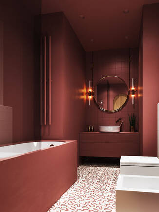
Colour is emotion. So what could be more fitting than adorning the most important retreat in the house with colour and putting your own stamp on the surfaces? Establish consistency or create an exciting colour contrast in any setting by coordinating the colours of the furniture, ceramics and tiles with the five FinishPlus surface finish designs. Many customers ultimately feel free to create visual highlights and express their taste in the bathroom or guest WC.
Colour to kick-start design in the modern bathroom
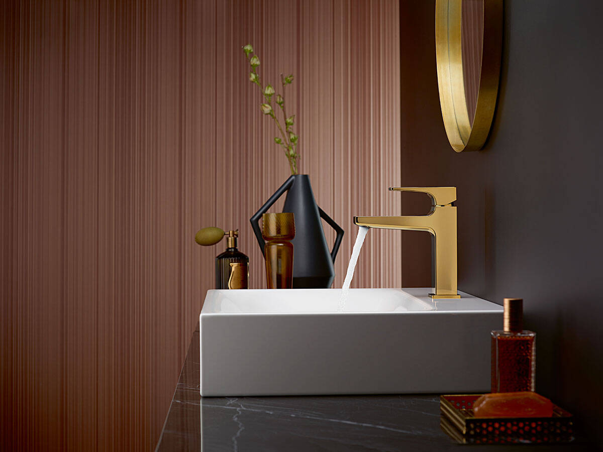
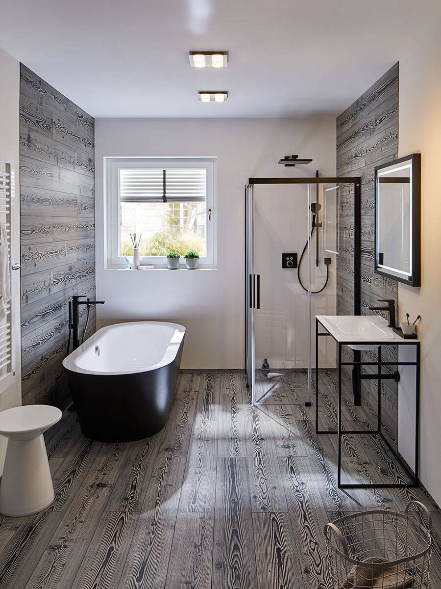
Do your bathroom customers want a luxurious splash of gold or an optical explosion? Are they fascinated by trends - perhaps the industrial style or minimalist black and white? Or maybe they want their bathroom to make a distinguished statement? Alongside colour in design, interior design is embracing brushed and matt surfaces that boast a great feel. The FinishPlus colour palette, which is inspired by international trends, offers the right answers to bathroom professionals and planners: So you can pick the right tap design to highlight the colourfulness of trendy natural stone and wood surfaces or metallic shades in the room.
Playing with combinations fascinates bathroom lovers
Elegance and modernity are combined with the upscale metallic colours of brushed black, polished gold and brushed bronze. Matt black and matt white are perfect for minimalists and fans of modern architecture. Show your bathroom customers how the personal choice of surface finish on taps and accessories can round off and blend in with the surrounding materials (or create a visual spectacle by combining two finishes).
Which colours are in fashion? Designer Uta Kurz reveals all in our interview

Four questions for the hansgrohe seminar speaker on the current colour trends and what to look out for when combining them.
Why are we seeing a renaissance of colour in the bathroom?
Uta Kurz: Digital printing has had a major impact on décor and colour over the past ten years, as it has made it possible to replace traditional white tiles with ones with a wood effect or decorative stone- or marble-like surface finishes. At the same time, new materials have come onto the market: designer flooring, waterproof wallpaper, cosy and natural surface finishes that are also suitable for wet areas.
Wooden hues, stone effects and muted colours are on trend. Why is this?
Uta Kurz: We are living in a very technical and demanding world and we want balance. At the moment, people seem to be gravitating towards cosiness. So there is a trend towards natural colours in furnishings. The main thing here is to match them with your own personality. Context is key: brass or gold effects look great in a feminine bathroom, whereas stainless steel wouldn’t quite work.
The metallic colours of FinishPlus, for example, have natural influences. What are your tips for creating a consistent combination?
Uta Kurz: Generally speaking, combining three colours is always a good option. If I take grey and white, it makes sense to add a bold colour such as red or green. And when I think of natural colours, then the options range from beige, light blue and shades of brown to wooden hues or bright yellow. But always three, no more. The ceiling, flooring and furniture are the elements that dominate the room. And no more than three colours should be used for the theme. Accessories can also be selected to match the colours.
FinishPlus is the perfect way to create contrasts. Is there a risk of going overboard here?
Uta Kurz: I can certainly add energising or calming elements to the bathroom. Everybody has a certain colour scheme within them, but most don’t even know it. And if this colour scheme influences the room, the probability of going overboard is very low. When used subtly, warm and cold contrasts are great for creating a sense of orientation that you don’t get with white on white. People will soon start to doubt a trendy colour such as a pink, which may not speak to them on a personal level but they think is fun right now.
You can find more input from Uta Kurz on her website.
Colour in the bathroom: be inspired
Trusted partners


